
Why Your Website Is Not Generating Leads: 10 Problems to Fix
Getting traffic but few inquiries? Find 10 website problems that block leads, from unclear messaging and slow pages to difficult forms and missing tracking.

A website can look polished, receive steady traffic, and still produce very few inquiries. That does not automatically mean the whole site needs to be redesigned. Lead generation is a connected path: the right person has to arrive, understand the offer, trust the business, see a sensible next step, complete it without friction, and receive a useful response. If any part of that path breaks, more traffic usually sends more people into the same problem. The practical response is to identify the weakest step, fix it, and measure what changes.
Start With the Lead Path, Not a Redesign
Before changing colors, layouts, or platforms, define what a lead actually is for the business. It may be a completed inquiry form, a booked consultation, a qualified phone call, a request for a quotation, or a product demo request. A page view, a scroll, or a click on a social icon may be useful behavior, but it is not automatically a lead.
Then map the shortest realistic path from arrival to that outcome: traffic source, landing page, message, proof, call to action, form or booking step, confirmation, and follow-up. This turns a vague complaint such as 'the website is not working' into a series of observable questions.
- Are the visitors likely to need what the page offers?
- Can they understand the offer without interpreting internal business language?
- Is there enough relevant proof to support the decision?
- Is the next step clear, useful, and proportionate to their level of intent?
- Can the action be completed on a phone, with a keyboard, and on a slower connection?
- Is the completed action measured and routed to someone who will respond?
Do not begin by asking what the website should look like. Begin by asking where the decision path stops.
1. The Page Does Not Quickly Explain the Offer
Many home pages lead with a slogan that sounds polished inside the company but says little to a first-time visitor. If someone has to search the page to learn what the business does, who it helps, and what result it provides, the opening message is doing too little work.
Use direct language near the top of the page. Name the service or product, the audience when it matters, and the practical outcome. Supporting detail can follow, but the first screen should give the visitor enough context to decide whether the page is relevant.
This is not an argument for flat or boring copy. Clear wording creates the foundation that distinctive voice, visuals, and brand personality can build on.
2. The Traffic Does Not Match the Offer
A low lead count may be a traffic problem before it is a page problem. An educational article can attract many early-stage readers who are researching a topic but are not ready to contact a provider. A broad paid keyword may attract people looking for a job, a free tool, or a definition instead of the service being sold.
Review each important landing page by traffic source. In Google Search Console, inspect the queries and pages producing impressions and clicks. In analytics, compare channels, landing pages, devices, and completed lead actions. The goal is not to label every visitor as good or bad. It is to see whether the promise that earned the click matches the offer on the page.
When intent is mismatched, revise the keyword targeting, title, snippet, campaign, or landing page. More visits from the wrong audience can make traffic graphs rise while inquiries stay flat.
Traffic is useful only when the reason for the visit and the purpose of the page belong in the same conversation.
3. The Call to Action Is Vague or Premature
Buttons such as 'Learn More,' 'Submit,' and 'Get Started' often hide what will happen next. A stronger call to action names the action or outcome: request a website review, book a consultation, check availability, get a quotation, or download the guide.
The size of the request should also fit the visitor's stage. Someone reading an introductory guide may not be ready for a sales call. A case study, pricing explanation, project checklist, or short consultation can provide a more natural next step.
Give each page one primary action. Secondary options can exist, but they should not compete equally for attention. Repeating the same primary action at sensible decision points is usually clearer than introducing a different button in every section.
4. Navigation Creates Too Many Decisions
A large menu is not automatically helpful. When labels overlap, service names are unclear, or every internal page receives equal emphasis, visitors must understand the company's structure before they can find the right path.
Organize navigation around the questions visitors bring: what is offered, who it is for, what relevant work has been completed, how the process works, and how to make contact. Use descriptive link labels and keep important paths available without turning the header into a complete directory.
The same principle applies inside a page. Related links should help the current decision, not interrupt it. If a visitor is evaluating a service, show the most relevant proof, process, and contact action before sending them into unrelated content.
5. The Claims Are Not Supported by Relevant Proof
Statements such as 'trusted,' 'innovative,' and 'results-driven' are easy to write and difficult for a visitor to verify. Proof is more useful when it answers the specific risk behind the purchase.
For a complex service, that proof may include a case study, a clear process, named expertise, relevant credentials, before-and-after evidence, or a detailed explanation of how risk is handled. For a local business, it may include current contact details, service coverage, real customer feedback, and accurate photographs of the people or place involved.
Use proof honestly. A relevant example with clear limits is stronger than a large claim without context. Avoid fabricated urgency, inflated numbers, stock testimonials, and logos that imply relationships the business cannot substantiate.
6. The Mobile Journey Only Works Technically
A responsive layout can still be frustrating on a phone. Text may be technically visible but too dense to scan. A fixed banner may cover the call to action. Tap targets may sit too close together. A form may trigger the wrong keyboard, or a menu may require several steps before the visitor reaches the service they need.
Test the complete lead path on an actual phone, not only in a resized desktop browser. Arrive from search or an advertisement, read the opening message, compare the service, open the navigation, use the primary call to action, complete the form, recover from an error, and confirm that the success state is clear.
Also test keyboard navigation, visible focus, zoom, text contrast, labels, and error messages. Accessibility problems and general usability problems often appear in the same places because both expose unclear interaction design.
7. Performance Delays the Message or the Action
Visitors cannot respond to an offer they are still waiting to see. A slow hero image, delayed fonts, heavy third-party scripts, unstable layout, or an unresponsive menu can weaken the lead path before the copy has a chance to work.
Google's current Core Web Vitals guidance defines a good experience at the 75th percentile as Largest Contentful Paint within 2.5 seconds, Interaction to Next Paint at 200 milliseconds or less, and Cumulative Layout Shift at 0.1 or less. These are useful diagnostic thresholds, not a substitute for testing the actual page and action on realistic devices.
Prioritize the templates that carry meaningful traffic and lead actions. Improve the limiting resource, verify the change, and watch field data over time. A perfect score on a low-value page matters less than a faster, more stable inquiry path.
8. The Contact Form Creates Friction or Uncertainty
A form should collect enough information to support the next step, not every detail the business may eventually want. Asking for budget, address, company size, phone number, project history, and several open-ended explanations before a first conversation can make a simple inquiry feel like an application.
For every field, ask why the information is required now, how it will be used, and whether it could be requested later. Use visible, descriptive labels. Identify optional information clearly. Give useful instructions where formats matter, and write error messages that explain what needs to be corrected instead of only saying that something went wrong.
After submission, show a clear confirmation and explain what happens next. If the form sends successfully but the page appears unchanged, visitors may submit again or assume the inquiry was lost.
- Keep only the fields required for the immediate next step.
- Use visible labels rather than placeholder text as the only instruction.
- Preserve valid answers when another field has an error.
- Make errors identifiable in text and connect them to the affected fields.
- Provide an accessible success message and realistic response expectation.
- Test delivery, spam handling, notifications, and the destination inbox regularly.

9. Lead Actions Are Not Measured Correctly
Without reliable measurement, a business can mistake activity for progress. Page views, session duration, and button clicks can provide context, but the site should also record the action that represents a genuine inquiry.
Google Analytics recommends the generate_lead event when someone submits information as a lead. Depending on the website, this can be triggered by a verified form success state or an appropriate confirmation page. Phone calls, bookings, chat inquiries, and qualified offline outcomes may need separate tracking and CRM handling.
Test the implementation from beginning to end. Confirm that one real submission produces one lead event, that failed submissions do not count, that duplicate events are not sent, and that consent choices are respected. Compare analytics with form records or the CRM so missing data becomes visible.
If the lead action is not measured reliably, the website cannot explain which changes actually helped.

10. Follow-Up Does Not Match the Website Promise
The website does not stop working when the form is submitted. A lead can still be lost through a missing notification, an inbox nobody owns, an unclear handoff, a slow response, or a generic reply that ignores what the person asked.
Set an honest expectation on the confirmation screen and in the acknowledgment message. Route the inquiry to the correct person, preserve the source and page context, and make ownership visible. If the response time varies by request type, say so rather than promising an unrealistic universal turnaround.
Review lead quality as well as lead quantity. If inquiries repeatedly misunderstand the offer, the website may need clearer qualification, pricing context, service boundaries, or examples before the form. Follow-up data should improve the page, not remain separated inside a sales inbox.
A Practical Website Lead Audit
Run the audit in an order that separates measurement problems from experience problems. Avoid changing several unrelated elements at once, because the result will be difficult to interpret.
- Define the primary lead action and confirm that it is tracked once, only after success.
- Choose the highest-value landing pages by relevant traffic, service priority, or revenue potential.
- Compare traffic source and search intent with the offer on each page.
- Test the complete path on mobile, desktop, keyboard, and a constrained connection.
- Review the opening message, proof, primary call to action, form, confirmation, and follow-up as one journey.
- Use analytics, Search Console, form records, user feedback, and session evidence where consent and policy allow.
- Prioritize the largest observable break, make a focused change, and allow enough qualified traffic to evaluate it.
Fix the Weakest Step Before Buying More Traffic
A low-performing website does not always need a complete rebuild. Sometimes the main problem is an unclear first screen, a mismatched campaign, a broken mobile form, missing measurement, or a follow-up process that fails after submission. In other cases, several connected problems make a broader redesign the more responsible choice.
The decision should follow evidence. Define the lead, observe the path, fix the strongest constraint, and verify the result. Once the page helps the right visitors understand, trust, and act, additional traffic has a better chance of creating business value instead of amplifying waste.
More traffic is an amplifier. Improve the path before turning up the volume.
Verified references
Sources & Methodology
Recommendations were checked on August 30, 2026 against Google Search Console and Google Analytics documentation, Google's Web Vitals guidance, W3C accessibility guidance, and the GOV.UK Design System. They are diagnostic principles, not a promise that any single change will increase a conversion rate.
- Performance Report: Search ResultsGoogle Search Console Help: Official guidance for reviewing search queries, pages, clicks, impressions, devices, and search traffic.
- Web VitalsGoogle web.dev: Official definitions and recommended thresholds for LCP, INP, and CLS.
- Recommended EventsGoogle Analytics Help: Official lead-generation event guidance, including generate_lead and later lead stages.
- Forms TutorialW3C Web Accessibility Initiative: Accessibility guidance for labels, instructions, validation, notifications, and multi-step forms.
- Question PagesGOV.UK Design System: Guidance for asking only for information that is needed and explaining why each question is asked.
Clear answers before you plan
Frequently Asked Questions
Why is my website getting traffic but no leads?
Common causes include traffic that does not match the offer, an unclear opening message, weak proof, vague calls to action, poor mobile usability, slow or unstable pages, difficult forms, broken measurement, and weak follow-up. Check the complete path before assuming traffic volume is the only problem.
What is a good website lead conversion rate?
There is no reliable universal rate. Results vary by industry, traffic source, offer, buying cycle, geography, device, page type, and how a lead is defined. Establish a clean baseline for qualified traffic and genuine lead actions, then compare the same journey over time.
Do I need to redesign my entire website to get more leads?
Not always. A focused improvement may be enough when one clear problem is responsible, such as a broken form or mismatched landing page. A broader redesign makes more sense when messaging, navigation, templates, accessibility, performance, content, and measurement are all constrained by the current system.
How should I track website leads in Google Analytics?
Track a verified success action rather than a form-button click alone. Google Analytics recommends the generate_lead event for submitted lead information. Confirm that successful submissions count once, failed attempts do not count, and the analytics data can be reconciled with form or CRM records.
How long does it take to know whether a website change worked?
It depends on traffic volume, lead frequency, seasonality, and the size of the change. High-traffic pages may produce useful evidence quickly, while lower-volume service businesses may need several weeks or longer. Avoid judging from a handful of sessions or changing the test before enough qualified visitors have used the page.
A practical next step
Find out where the lead path is breaking.
Share the website, target audience, important traffic sources, and the action visitors should complete. ConduitCode Labs can review the path and recommend a focused next step.

About the author
Wayne Pastoral
Full-stack developer behind Conduit Code Labs, working across Shopify, WordPress, web applications, performance, accessibility, and integrations.
Learn more about WayneContinue reading
More from Business & Commerce

Can AI Find Your Business? A 2026 Guide to ChatGPT, Claude, and Google AI Search
See how ChatGPT, Claude, Google AI Overviews, and AI Mode find business websites, what improves visibility, and which AI SEO claims you can ignore.
Read article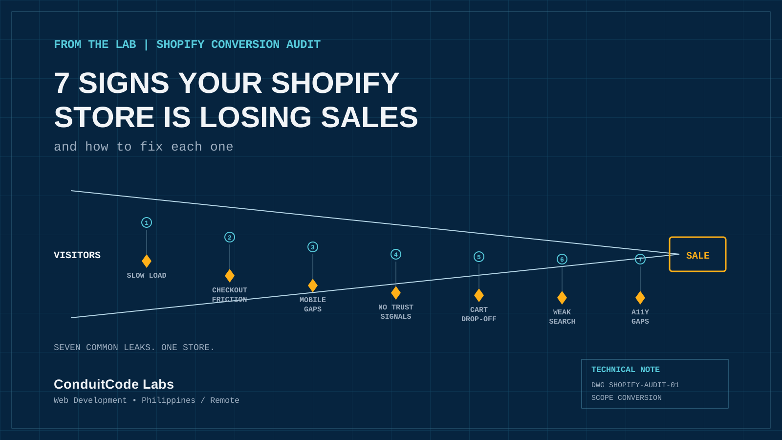
7 Signs Your Shopify Store Is Losing Sales
Traffic is not always the problem. These seven conversion leaks can quietly cost sales across product pages, checkout, mobile UX, trust, search, cart recovery, and accessibility.
Read article
Does Your Small Business Need a Website If You Already Have Social Media?
Already using Facebook, Instagram, or TikTok for your small business? Learn when social media is enough, when a website matters, and how both work together.
Read article